Do you ever see a design that just works and you aren’t sure why it does? Portland illustrator and tattoo artist Melissa Dow @melissadowart discusses 4 techniques for creating visually interesting art in the latest Pentalic blog.
By Melissa Dow
Have you ever had somebody tell you that they really like a piece of artwork you’ve done, and when you ask them why they like it, they can’t point to a specific reason? Sometimes people don’t know why something is visually appealing, it just simply is. It’s a gut instinct. The design just works. I like to call this quality visual interest because it’s, well, interesting to look at.
Over the years, I have found that there are a few things you can do to bring more visual interest to your drawings. They aren’t overly complicated or difficult to do, and if you really take a look at your work, you’re probably using these principles already in some form. All of these principles work with purely black and white, as well as color (because color needs visual interest and contrast as well). Since I generally do blackwork style tattooing, I do tend to think in terms of pure value first and foremost.
Value Reversals
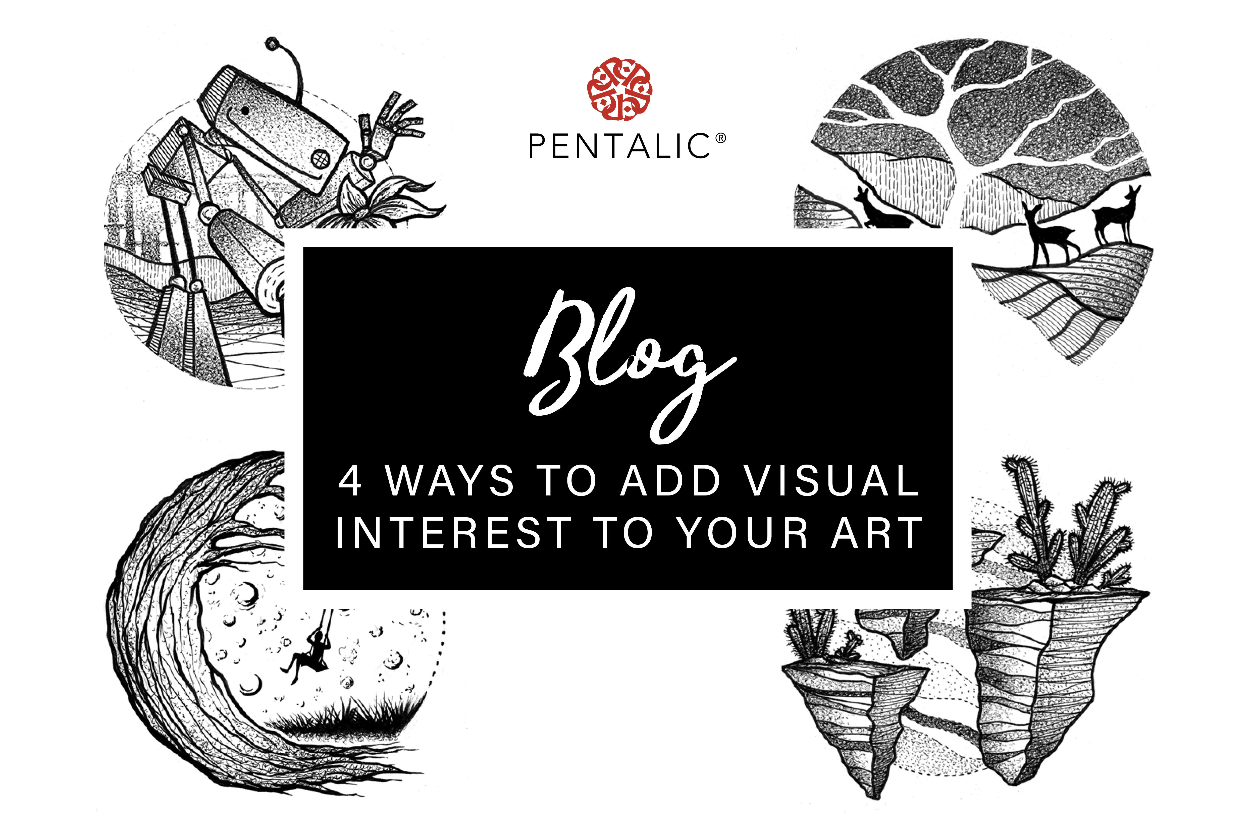
This sounds a bit fancy, but it’s actually really simple. Just think of white over black, or black over white; or near one end of the value spectrum over another end, with at least enough range between them that they stand out from one another when you squint your eyes. This looks especially interesting when you put one value reversal next to another and switch the transition back and forth. It creates an appealing rhythm for the eye to follow around the piece. I use this a lot in tattooing with dotwork, as it makes a very nice gradual fade in and out. It’s also a great way to solve those tricky visual problems where something needs to be pushed forward in space in more complex compositions (i.e. creating a sense of depth).
If you like to use pointillism in your work, this is a great technique, but it also works really well with charcoal, scratchboard and graphite media.
Negative Space
Sometimes, it’s actually the absence of a shape that is the most effective way to bring it to the viewer’s attention. Our eyes are always looking for things that stand out, so what if what stands out is the thing that’s just not there at all?
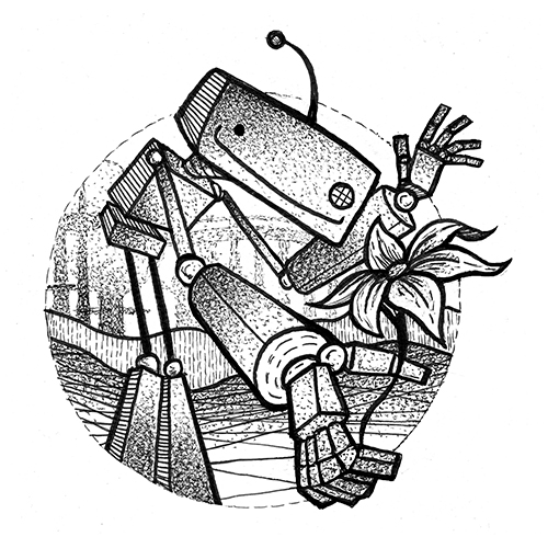
Negative space works really well when you have dense values around it. This can be in the form of patterns or detail work, so that, in contrast, the negative space becomes even more apparent. In a sense, negative space is very much the same thing as using a silhouette. I tend to think of negative space as being white, or close to white, and silhouettes as pure black, but that’s certainly subjective.
I love using negative space when it bumps up against the edge of the composition, especially when it creates an open cut-out effect between the negative space shape and borders of the piece. A good number of my tattoo designs incorporate this element, because I think it’s an especially appealing effect when skin is showing through the open areas of the design, and it is a great way to create contrast between darker, busier areas.
Negative space can be created easily with traditional media using white-out, gel pens and old school masking fluid.
Silhouette
Sometimes details aren’t all that important and can be thrown out entirely. Our brains do an amazing job of filling in missing details for us. We go through our daily lives very much navigating the world through a quick read of shapes and values. So, why not use that to our advantage when we create art?
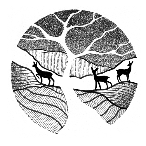
Silhouettes are a powerful tool. The noir genre, both movies and comics, have been using them for a long time. They also derive very much from the value reversal principle. The key with using silhouettes is to make sure that they are clearly defined and readable from whatever they are in front of, otherwise, they can be confusing. A sharp, defined edge on silhouettes really makes them pop, and, sometimes, all you need is a distinct detail or two for the viewer to understand exactly what it is. Silhouettes don’t need to be large either. Sometimes it’s more effective to place a small silhouette inside a larger area of a light value, as shown in my example of the swinging figure in front of the moon. They’re also great for creating a sense of mood.
Try playing around with some different silhouettes with the intention of them being specific objects and see how easily you can get them to read. One of my favorite ways to do this is super fun and simple: use nothing but a dark gray marker on white paper.
Size and Shape Variation
Images with things that are all the same size tend to not be as dynamic than those with shapes of varying sizes. Sometimes you want your work to have a static, even quality to it (just about every shot in Wes Anderson’s movies, for instance), in which case, size similarity is intentional. But, I occasionally see this technique being used by newer artists, who maybe don’t realize that making this one small change could make a world of difference in their work. Of course, we use size variation in compositions to create a sense of three-dimensional depth in an otherwise two-dimensional plane, but size isn’t just about seeming closer or further away, it’s about visual interest.
Along the same lines of size, is shape variation. The world around us isn’t all circles, or all squares, it’s made up of a wide range of varying compound shapes. That doesn’t mean that all your shapes all have to be off-the-wall crazy. There is beauty in shape simplicity. Otherworldly shapes tend to create a more successful piece of art when they are varied. Our eyes like to see different shapes together, and we can’t help but try to make images out of them.
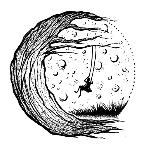
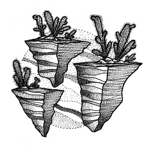
For example, in my floating cactus island design, if I had made the islands and cacti all exactly the same size and shape, it wouldn’t work as well. The islands and cacti share similar shape languages, but are not the same. Try playing with even subtle variations and see how that can push the visual appeal of your drawings.
Both of these principles, along with silhouette, also play a huge role in character design. So, if you like to create characters, shape and size variation are always great principles to keep in mind.
Ultimately, all of these tips work towards the same purpose: to create contrast. Contrast creates interest. If you want to draw the eye towards something in particular, create contrast in or around it; be that through value, size or shape. Make it stand out. There are certainly more ways to create interest, but these are my personal favorites.
I hope these tips have been helpful to you. Go forth, create wonderful things, bring some visual interest to the world around you!
Follow Melissa!
Instagram: @melissadowart
Facebook: Melissa Dow Art
Website: www.meldow.com


